

%402x.svg)
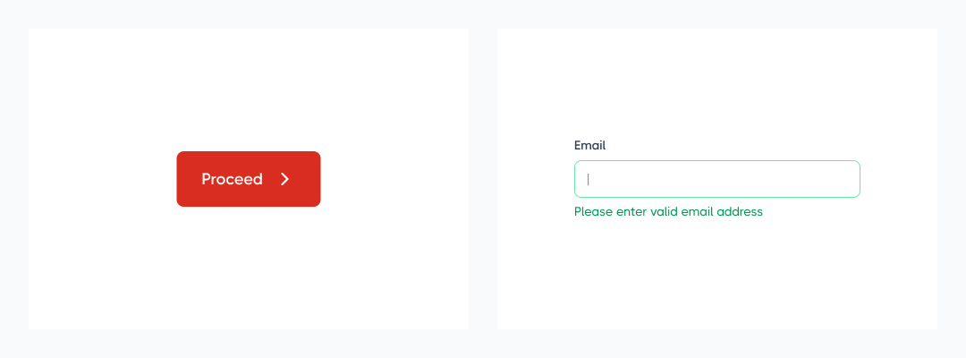
Ever seen a button that’s red but actually means “proceed”? Or an error message that blends in because it’s the same color as a success alert? That’s what happens when UI design lacks a proper color system.
In UI/UX design, colors should not just look good, they should communicate meaning. This is where semantic colors come in. Instead of defining colors based on visual names like “blue” or “green,” semantic colors label them based on their function (e.g., “error,” “success,” “warning”).
This guide will break down what semantic colors are, why they matter, and how to apply them effectively in your UI/UX projects.
Semantic colors are color labels that describe their function, not their appearance. Instead of calling a color “red-500” or “green-light,” you use names like:
✅ color-success (instead of “green”)
✅ color-error (instead of “red”)
✅ color-warning (instead of “yellow”)
This helps maintain consistency and makes UI components more scalable – especially in large design systems or developer handoffs.
Imagine your brand decides to change its success color from green to blue. If you’ve used direct color names (green-primary), you’ll have to manually update every instance in your code or design.
With semantic colors (color-success), you only change it in one place, and everything updates automatically.
By using functional naming instead of visual naming, your design becomes more flexible, scalable, and accessible.
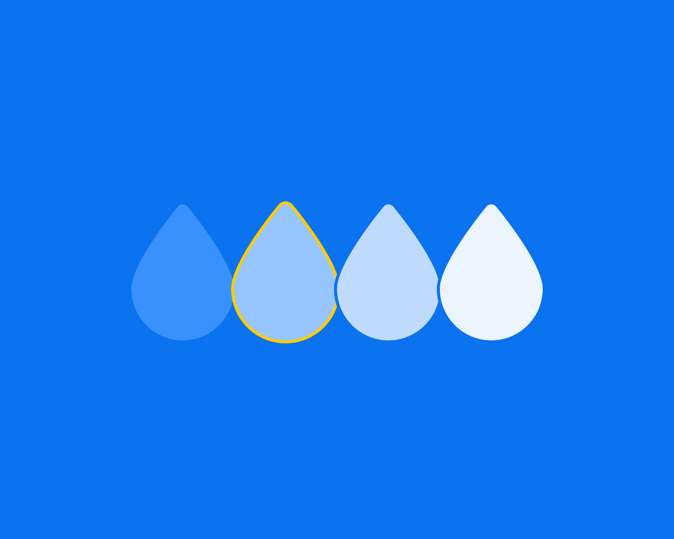
Before applying semantics, you need a core palette. This includes:
Use 60/30/10 rules to control your UI from chaos.
Assign functional names like:
Use semantic colors for buttons, forms, notifications, and backgrounds instead of hardcoded hex values.
A design system should include clear guidelines on when and how to use each semantic color. This makes handoffs easier for developers and ensures a consistent UI.
Bad: button-bg-blue (This is too specific – what if the button color changes?)
Good: color-primary (Keeps it flexible)
Stick to a simple set of primary, success, warning, and error colors. Too many variations lead to inconsistency.
Always check color contrast to ensure text remains readable (use tools like WCAG contrast checkers).
Semantic colors bring clarity, consistency, and scalability to UI design. Instead of picking colors based on how they look, label them based on what they do.
By applying a functional color system, you’ll create designs that are easier to manage, scale, and hand off to developers – without compromising on accessibility or branding.
So next time you design a UI, think beyond the color wheel – think functionally!